
Knowing CMYK Cyan Magenta: A Comprehensive Guide to Packaging Color Printing
Have you had a situation where your packaging design appeared perfect on the screen but the final product had different tones than what was shown online? Perhaps your bright blue color turned greyish or your vivid pink turned purple. It does not necessarily mean that there was something wrong with printing. The problem is likely related to the digital to CMYK conversion process.
Color matching is very important in packaging as it defines how the brand looks and how it is perceived. Therefore knowing Cyan, Magenta, Yellow & Key (Black) will help you get predictable results, select the right colors & save a lot of money. In this article you will find information about CMYK, cyan and magenta, CMYK vs RGB and the influence of such factors as printing techniques as well as paper on the final color of packaging.
What Is CMYK?
CMYK is an acronym for cyan, magenta, yellow & key colors. The last one represents black ink. It is referred to as a subtractive color mode because it uses multiple layers of color applied to white to create a print image. These layers subtract light but do not add it. Therefore it is the reverse of what happens on RGB screens which use an additive mode that combines red, green & blue light.
Everything you can see in a print of a package box like deep navy blue and pastel pink colors, comes as a result of mixing cyan, magenta, yellow and black colors in different combinations. A designer or printer needs to find the right combination of all four colors to get the required shade.
What Does CMYK Stand For?
CMYK is a 4 color process that consists of Cyan, Magenta, Yellow, and Key; Key is the name given to the black ink used. The letter K has been used to represent the key because of the plate that carries the black detail also called the key plate.
These are the 4 basic colors that form the basis for producing all other colors through mixing. With the various combinations of cyan, magenta, yellow, and black, you can create thousands of different colors from only four inks. This is the reason why CMYK is deemed the process behind proper color reproduction on cheap custom box packaging.
What Is the CMYK Subtractive Color Model?
CMYK is known as the subtractive color model since it works on subtracting wavelengths from the white surface instead of emitting light like a screen-based device does. The CMYK subtractive color model is an upgrade of the simple CMY additive color model which involves cyan, magenta and yellow colors but excludes black ink.
In technical terms the process of working with a subtractive model involves starting with a white reflection of light off the substrate which is normally paperboard in the case of packaging, followed by printing different inks that absorb certain wavelengths while reflecting others to the eyes of the observer. Each ink blocks specific wavelengths of light & a combination of these inks creates all those colors we see on packaging materials.
Lets take a look at the basic CMY correlation
- White light – red = cyan
- White light – green = magenta
- White light – blue = yellow
A Short History of CMYK
The use of CMYK printing dates back more than a century. Four color wet-on-wet printing was developed by the Eagle Ink Printing Company back in 1906 using cyan, magenta, yellow and black to create process inks for the first time. They did this through the splitting of a design in its constituent four colors then printing each of these colors in equally distributed halftone dots.
Different angles were used when printing the dots to create the picture. This company successfully generated a large variety of colors using just four colors thus creating the foundation for the current CMYK process used in packaging and commercial printing.
How Cyan and Magenta Really Work
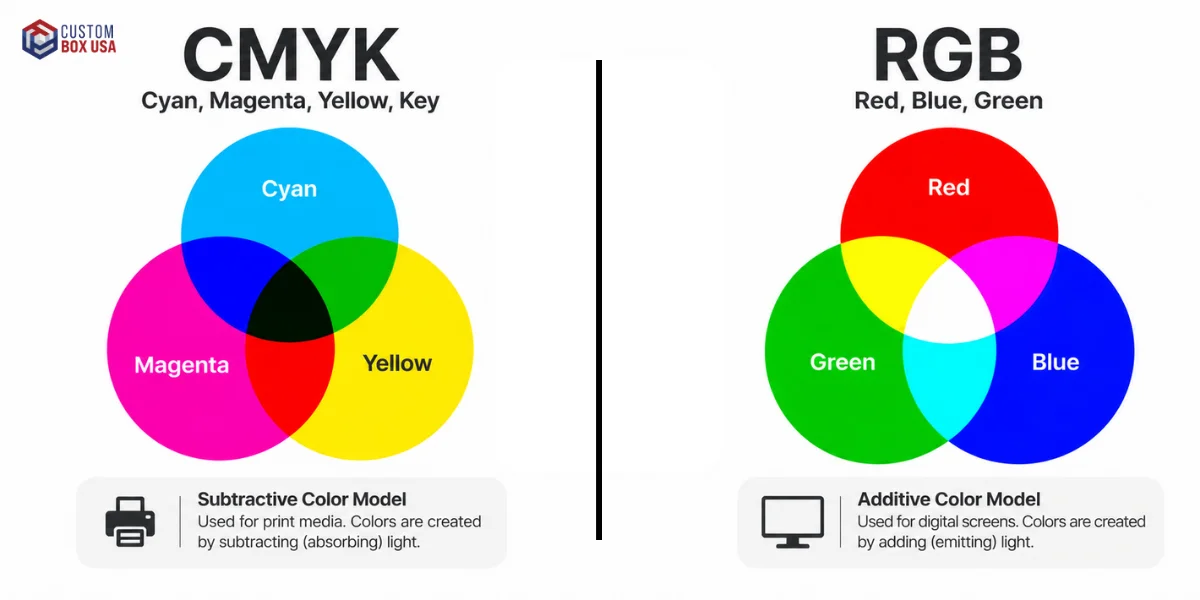
The two colors responsible for most of the work in the CMYK printing process are cyan and magenta. They are especially important for reproducing blue, purple and skin tones.
Cyan is a cold blue green pigment. It absorbs red light and reflects blue green light to your eye making it appear a bright, cool blue color on the paper.
Magenta is a dark purplish red pigment. It absorbs green light and reflects red and blue light making it appear pinkish red.
Mixing cyan and magenta produces deep blues and purples. Mixing these with yellow produces reds and greens. Black or key is the one that adds contrast, depth, and shadows to an image. It is also the main color for printing sharp and clear text.
For this reason, cyan and magenta deserve special consideration during the design process. A slight variation in either will have visible effects on the packaging's blue, purple and skin color.
Rich Black vs Key Black
Black does not print the same in CMYK each time. There is 100% K black which is also known as key black. Printing this type of black uses only the black ink channel. It is useful when you need to print small text, thin lines & details as it boosts clarity and reduces registration problems.
When printing needs involve larger areas of black or solid blacks the printer may opt to print rich blacks. Rich blacks involve mixing black ink with varying amounts of cyan, magenta & yellow inks to produce a denser black color. An example is 60% C, 40% M, 40% Y and 100% K but the best mix may vary based on the printer and printing method.
The important thing here is that 100% K is used for small text and fine details while rich black gives a better effect in solid areas.
Total Ink Coverage: When Too Much Ink Leads to an Issue
Each printed space has an upper threshold for CMYK ink absorption by the substrate under the particular printing process. The concept of total ink coverage or Total Area Coverage describes it. The value is calculated by summing the percentage shares of cyan, magenta, yellow and black ink in a color.
For instance the color of 70% C, 60% M, 50% Y and 100% K ink build has a total ink coverage of 280%.
There is no universal TAC limit applicable to any package printing project. The specific limitations vary depending on the press, ink type, paper/board used & printing process conditions. The typical limitations range from 260% to 320%, based on multiple factors. Exceeding the printer's stated value may be one of the causes of drying issues, set off & dull shadows, etc.
Always verify your printer's max ink coverage requirements before submitting artwork.
Understanding CMYK Proofing
Proofs allow you to see how your artwork will be reproduced before any large scale production. All proofs are not created equal.
Soft proof
The artwork is viewed on a properly calibrated screen. It is helpful when designing but needs good calibration of your screen & viewing conditions.
Contract or hard proof
A calibrated proof is created, simulating the reproduction. These proof can be used to approve the color.
Press proof
A test print created using the printing process & materials that will be used in production. It gives you an idea of what the final product will look like but it is more expensive.
When creating packaging, the best method of approval is to consider the printing process, substrate, ink system, and finishing. If color is crucial, talk to your printer about the appropriate proofing method for your project.
CMYK vs RGB: What Does It Mean for Packaging?
Many problems that arise when printing colors can be traced to confusion in the CMYK and RGB color models. Below is an easy to understand comparison of the two systems.
|
Feature |
CMYK |
RGB |
|
Format |
Physical ink on paper or cardboard |
Light on digital displays |
|
Type |
Subtractive (ink accumulates to make darker colours) |
Additive (light accumulates to make brighter colours) |
|
Ideal For |
Packaging, boxes, business cards & magazines |
Websites, video & digital images |
|
color palette |
Limited range of color |
More extensive range of color |
The moment you use an RGB design and print it, you can be sure there will be a color shift. Red colors may look too bright, green colors may look washed out and blue colors will shift towards purple shades. This is one of the most common mistakes made while creating a custom box design.
- Tip: Never set your design program to CMYK mode at the end of your project. This way you will most likely get unexpected color shifts.
Why CMYK Is the Standard for Packaging Design
There are many reasons the CMYK colour model is the standard for packaging design.
- It was designed especially for printing not for screens so it works better with boxes, labels & cartons than RGB.
- It ensures color consistency in a long production process.
- It can be used in different types of printing like digital and offset.
- It make sures color consistency in the entire process from proofs to printing boxes.
For any company that needs its packaging design to remain unchanged each time it is printed there is nothing like CMYK.
Bleed and Safety Margins in Packaging Artwork
Color accuracy is one aspect of preparing your packaging artwork. In addition you need to have sufficient bleed in your packaging artwork to make sure that your background colors & images extend beyond the trim line.
The required bleed in packaging artwork is typically 3 mm to 5 mm but the exact amount depends on multiple factors like your printer, dieline & production process. Your logo, text & product information must remain in the safety margin.
You must always consider your printer's dieline & artwork specifications instead of standard measurements.
How to Determine When to Use Pantone or Spot Colors
CMYK can produce many colors however some specific brand colors may not be included in its printable palette. In these cases Pantone or another spot color may be the best option.
In contrast to CMYK where many process inks form a color, spot color uses an ink formula that is separate from the process used in CMYK. This technique is specific to brand logos, signature colors and other similar colors that must maintain consistency.
Certain packages may be printed using both CMYK and spot colors; advanced printing techniques may also use more than four process inks.
Selecting the Right Paper for CMYK Print
The paper or board you choose has a significant effect on the final appearance of printed colors, sometimes even equal to that of the ink itself. Here is a brief overview of the most common types.
Glossy Paper
The colors produced using glossy paper have high impact and a vivid look. As a result, the colors look more prominent and vibrant. This paper is a good option for packaging and promotional materials, as it can catch customers' attention in-store.
Matte Paper
Matte paper has no gloss but has a smooth, premium look. The colors produced on matte paper appear slightly less saturated than those on glossy paper, which is the main reason for choosing this paper type for luxurious packages.
Coated Paper
This type of paper has a special coating that allows control over how ink spreads making sure the neatness of images and text on the package. It is a great option for printing fine details on packaging including images & text.
Uncoated Paper
Uncoated paper is characterized by higher porosity and greater ink absorption resulting in slightly more muted, less saturated colors especially shades of blue or purple. This paper is usually used for eco packaging.
Recycled and Kraft Paper
These paper types give the packaging a natural appearance, with soft colors produced by CMYK printing. This paper type is commonly used in packaging for sustainable brands as it effectively conveys eco-friendliness. Example: Printed File Folder, kraft mailer boxes, organic product sleeves, and eco-friendly shopping bags.
Effect of Finishes and Coatings on Color
The effect of finishes & coatings on the appearance of the CMYK colors can be seen even after the printing process is completed. The gloss finish, matte coating, UV finish and soft touch film affect the reflection of light off the printed surface and thereby the perception of color.
The gloss coating can help produce more vivid colors while a matte and soft touch can produce more subdued colors. The effect of the finish is a part of the end result, and therefore the color that appears right before finishing will look different afterward.
For key brand colors use a proof with the same or a similar finish that will be applied to the end product.
Quick Suggestion Table
|
Goal |
Recommended Paper |
|
Bright & bold packaging colors |
Glossy paper |
|
Luxury or premium feel |
Matte paper |
|
Sharp, clean & detailed print |
Coated paper |
|
Rustic or eco friendly look |
Uncoated paper |
|
Sustainable branding message |
Kraft or recycled paper |
Understanding Ink Quality in CMYK Printing
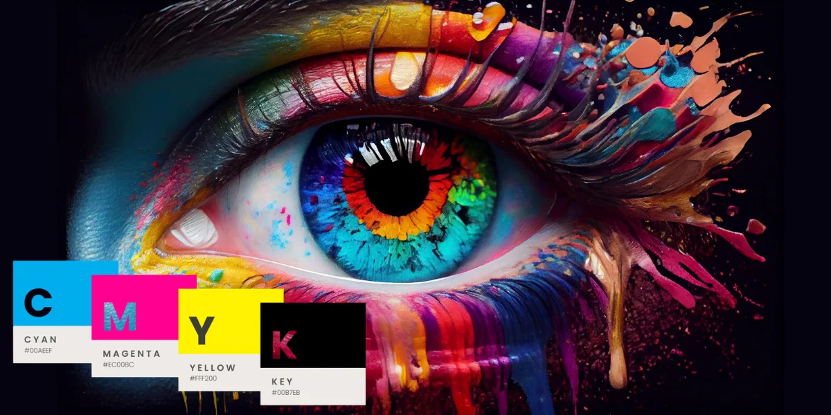
However paper alone is not the answer. The quality of the ink directly influences the accuracy and durability of your final color printout.
- Dye based inks produce bright colors but tend to fade relatively quickly.
- In contrast pigment based inks offer greater durability and resistance to moisture and light making them an excellent option for printing packaging materials intended to remain visible for an extended period.
- UV inks dry instantly under ultraviolet light and are perfect for glossy or coated materials.
Using poor quality ink is one of the fastest ways to ruin the color balance, create colorless tones & cause a mismatch in your final output and the original design file. In packaging printing where color is integral to brand recognition it would be unwise to compromise on ink quality.
How Paper Type Affects the Printing of Cyan and Magenta
All materials have different properties that affect how they interact with cyan and magenta inks and colors something many novice packaging purchasers may not rrealize
On coated stock ink tends to sit higher, producing sharper dots with greater color density and more vivid cyan and magenta hues. Coated stocks are used in expensive catalogs, packages & complex artwork.
Uncoated stocks are really porous & allow ink to penetrate the material therefore the sharpness of individual dots is lost & color saturation is reduced especially in the blue/purple spectrum where cyan and magenta operate predominantly.
Specialty materials like packaging board, film & synthetic materials depend heavily on their coating and ink systems but they can be designed to produce highly saturated colors.
- Tip: Do not assume that the proof & approval on a home inkjet printer using uncoated paper will match what is printed on coated packaging board; cyan and magenta in particular may change drastically in these two substrates.
Kraft, Corrugated, and Dark Color Substrates
Substrates like Kraft paper, corrugated board & metallic or dark colored papers may affect the perception of CMYK colors. These substrates do not have the properties of bright white coated paper and their inherent color or texture might affect the color result.
When using dark substrates or Kraft brown paper, CMYK inks are usually more transparent than when used on opaque surfaces. Using an underlying layer of white ink before printing CMYK artwork can make the colors look more vibrant and uniform than process colors.
Without white ink underprinting, colors printed directly on a dark/brown substrate can appear dim & deviate from the actual colors.
Color Print Mistakes When Using CMYK
Also, the most experienced graphic designers can sometimes have color issues. Below are the most frequent ones.
- Designing with RGB and not CMYK results in color distortions after printing, particularly in the case of red & green colors
- Providing the file without a proper color profile causes the printer to guess which color conversions to do
- Putting excessive ink may cause smearing or a longer drying process
- Losing details in deep blacks or gradients makes your package look lifeless & unattractive
- Approving the proof on incorrect material, thus having a misprint in the end
If you are a packaging business, also minor color errors can lead to additional costs, order delays & unhappy clients.
Best Practices for Getting Correct CMYK Colors
There are some simple things that will help you avoid most of the typical color related mistakes made by packaging brands.
- Set your document up to be created in CMYK from the very beginning
- Carefully watch how blues, purples & skin colors turn out because these ccolorsdepend on cyan and magenta the most
- Use only the black channel to make the text visible and readable not the cyan, magenta & yellow channels combined
- Select your paper and ink according to the result rather than their price
- Always ask to have a physical proof done before making the final print run on the actual material
Adhering to the above mentioned recommendations is the easiest way to avoid unexpected problems after your product leaves the printers.
CMYK Packaging Artwork Checklist
Before sending your packaging artwork to be printed please make sure of the following
- color mode: Make sure the artwork is set to the correct CMYK color mode
- Images: Use high resolution images at 300 DPI for the final packaging artwork size
- Bleed: Bleed background colors & images out past the trim line per the printer's instructions
- Safe area: Make sure all text, logos & graphics stay away from cut and fold lines
- Fonts: Make sure fonts are embedded or text is converted to outlines when printers need it
- Dieline: Keep the dieline layer separated & follow the printer's instructions regarding cut lines and creases etc
- TAC limit: Ensure heavy CMYK builds stay below the printer's TAC limit
- Black: Use a proper black build for text, fine details & large solids
- Spot colors: Note any Pantone or other spot colors used in your artwork
- Proof: Make sure you have viewed a suitable proof before printing the production run
Preflight is your chance to make sure you do not get any technical problems at the printer.
Frequently Asked Questions
What does CMYK mean in printing?
CMYK is short for Cyan, Magenta, Yellow & Key, where Key is the abbreviation for black ink. The combination of all four inks enables the production of all other colors in printing.
Why should I use CMYK instead of RGB for printing?
CMYK is specifically designed for physical printing on surfaces, while RGB was initially developed for computer displays. Therefore, CMYK will give you much more predictable results.
How should I convert RGB to CMYK for my prints?
Usually, any graphics software has an option to change the document's color profile. It is recommended to set it up in the beginning instead of converting an RGB file later.
In what way do CMYK and Pantone differ from each other?
CMYK combines four different kinds of inks to create many shades whereas Pantone uses premixed ink colors for an accurate color match. Pantone colors are usually used when a specific brand color is needed.
Why is color accuracy important for custom packaging?
In many cases, packaging is the first touchpoint a customer has with a brand. Inaccurate packaging colors can spoil the whole impression & create an expectation that won't be met.
What steps can help to avoid color problems in printed packaging?
All files should start in CMYK format. Special attention should be paid to the blues & skin tones in a picture, appropriate paper and ink should be selected & a proof should be offered before production starts.
Conclusion
Good packaging goes beyond having a good design. It also involves making sure that the design prints exactly from what you have on your screen. The CMYK process, particularly the proportions of cyan and magenta, plays a significant role in ensuring accurate & professional-looking colors.
The use of the right type of paper and ink, proper file preparation & approval of proofs, among other factors, affect the outcome. Understanding the CMYK process helps you make better printing decisions with Custom Box USA, eliminate surprises & produce packages that look amazing on screen as well as in print.
Finally, the main aim is to make sure that the approved colors match what those consumers see